
Typography is often regarded as the backbone of design, serving as a crucial element that can make or break a visual composition. When you think about it, typography is not just about choosing a font; it encompasses the arrangement of text, the spacing between letters, and the overall aesthetic that communicates your message. In your designs, typography can evoke emotions, guide the viewer’s eye, and create a hierarchy of information.
It’s the silent communicator that speaks volumes about your brand or project without uttering a single word. Incorporating effective typography into your design can elevate the overall quality and professionalism of your work. When you pay attention to typographic details, you demonstrate a level of care and consideration that resonates with your audience.
Whether you are designing a website, a poster, or a business card, the right typography can enhance readability and ensure that your message is conveyed clearly. By understanding the importance of typography, you can create designs that not only look good but also function effectively in communicating your ideas.
Key Takeaways
- Typography plays a crucial role in design by enhancing readability and visual appeal.
- Different typefaces can evoke different emotions and convey different messages, impacting the overall design.
- When choosing a typeface, consider the tone and message of the design to ensure it aligns with the intended communication.
- Typography is a key element in branding, as it helps to establish a brand’s identity and personality.
- In user experience, typography can affect how easily users can navigate and interact with a design, emphasizing the importance of legibility and hierarchy.
The Psychological Impact of Typography
Typography has a profound psychological impact on how your audience perceives your message. Different typefaces can evoke various emotions and associations, influencing how people feel about your content. For instance, a bold sans-serif font may convey strength and modernity, while a delicate serif font might evoke feelings of tradition and elegance.
When you select a typeface, consider the emotional response you want to elicit from your audience. This understanding can help you craft a more compelling narrative through your design. Moreover, the way text is presented can affect readability and comprehension.
Research shows that certain fonts are easier to read than others, which can significantly impact how well your audience engages with your content. If you choose a typeface that is difficult to read, you risk losing your audience’s attention and undermining the effectiveness of your message. By being mindful of the psychological effects of typography, you can create designs that not only capture attention but also foster understanding and connection.
Choosing the Right Typeface for Your Design
Selecting the right typeface is one of the most critical decisions you will make in your design process. With countless options available, it can be overwhelming to narrow down your choices. Start by considering the purpose of your design and the message you want to convey.
Are you aiming for a playful vibe or a more serious tone? The typeface you choose should align with the overall theme and objectives of your project. Once you have a clear understanding of your design’s purpose, explore different typefaces that fit within that framework.
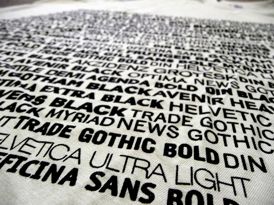
Pay attention to factors such as legibility, style, and versatility. A good practice is to create a mood board that includes various typefaces alongside images and colors that inspire you. This visual reference can help you see how different fonts interact with each other and with other design elements.
Ultimately, the right typeface will not only enhance your design but also resonate with your audience on a deeper level.
Typography and Branding
| Metrics | Typography | Branding |
|---|---|---|
| Font Size | 16px | Consistent across all platforms |
| Line Height | 1.5 | Uniform for all text elements |
| Font Weight | Normal, Bold | Reflects brand personality |
| Font Style | Italic, Normal | Aligned with brand guidelines |
| Color Palette | Black, Grey, White | Aligned with brand colors |
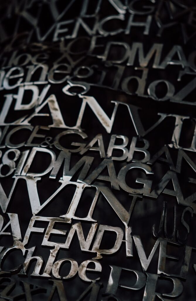
Typography plays an integral role in establishing and reinforcing your brand identity. The fonts you choose become synonymous with your brand’s personality and values. For instance, tech companies often opt for sleek, modern typefaces to convey innovation, while luxury brands may choose elegant serif fonts to evoke sophistication.
When you consistently use specific typefaces across all branding materials—such as logos, websites, and marketing collateral—you create a cohesive visual identity that helps consumers recognize and remember your brand. In addition to consistency, consider how typography can differentiate your brand from competitors. A unique typeface can set you apart in a crowded market, making your brand more memorable.
However, it’s essential to strike a balance between uniqueness and readability; an overly complex font may confuse potential customers rather than attract them. By thoughtfully integrating typography into your branding strategy, you can create a strong visual presence that resonates with your target audience.
The Role of Typography in User Experience
In today’s digital landscape, user experience (UX) is paramount, and typography plays a significant role in shaping that experience. When users visit a website or interact with an app, they expect information to be presented clearly and intuitively. Effective typography enhances usability by guiding users through content seamlessly.
This means choosing fonts that are not only aesthetically pleasing but also functional in terms of size, spacing, and contrast. Moreover, typography can influence navigation and interaction within digital interfaces. For example, using larger font sizes for headings helps users quickly identify sections of content, while consistent spacing between lines improves readability.
By prioritizing typography in your UX design process, you create an environment where users feel comfortable engaging with your content. This attention to detail can lead to increased satisfaction and retention rates as users navigate through your digital spaces.
Tips for Effective Typography in Design
Legibility: The Foundation of Good Typography
Prioritize legibility by ensuring that your text is easy to read across various devices and sizes. This may involve testing different font sizes and weights to find the perfect balance for your audience.
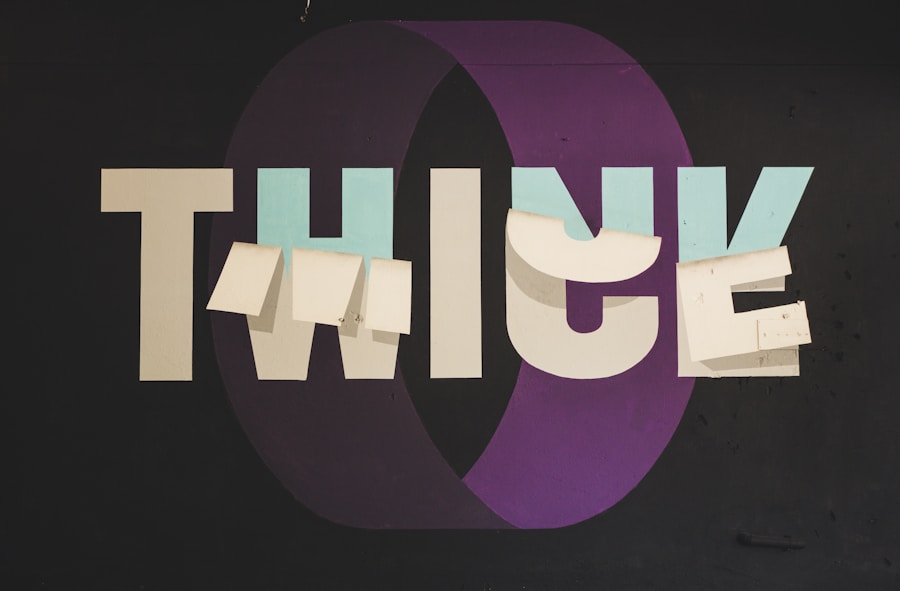
Creating Visual Harmony with Typography
Limit the number of typefaces used in a single design to create a more cohesive look. Sticking to two or three complementary typefaces can make a significant difference. Additionally, pay attention to line spacing and letter spacing, as adequate white space around text can significantly improve readability and overall visual appeal.
Contrast and Readability
Don’t forget about contrast; ensure that there is enough differentiation between text color and background color to make reading effortless. By following these tips and being intentional about your typographic choices, you can create designs that are not only visually striking but also effective in communicating your message clearly and engagingly.
If you are interested in learning more about Typography, you may want to check out the article “From the CMA Edit: Work from Divina Fernando Eblen”. This article showcases the work of a talented designer and provides insights into their creative process. It’s a great resource for anyone looking to gain inspiration and knowledge in the field of Typography.